Lakeland Shelter Website
November 2023
Role: UX/UI Designer (User Research, Interaction, Visual Design, Prototyping, and Testing)
The Client:
Lakeland Out of the Element Shelter is an institution committed to addressing the needs of the homeless population by offering essential services such as meals, shelter, and comprehensive support. They did not have an existing website. They needed to create a website that not only serves as an informative hub but also as a tool for amplifying the shelter's impact on the community and improving its ability to connect with those seeking assistance.
The Goal:
Their goal was to provide information about their mission, programs, and overall initiatives. Additionally, they aimed to encourage individuals to contribute financial support to the shelter with donations.
Research and Planning:
I created user personas as a step in our strategic planning for the website. This gave both myself and the client more comprehension of the users that would engage with the platform. It gave us insights into the specific needs, objectives, and behaviors of the individuals who would be interacting with the website. This informed our decision-making in design and functionality and also gave us a user-centric perspective throughout the developmental process.
The Solution:
I proposed content recommendations to assist the client in generating tailored website content aligned with the identified personas and user flows.
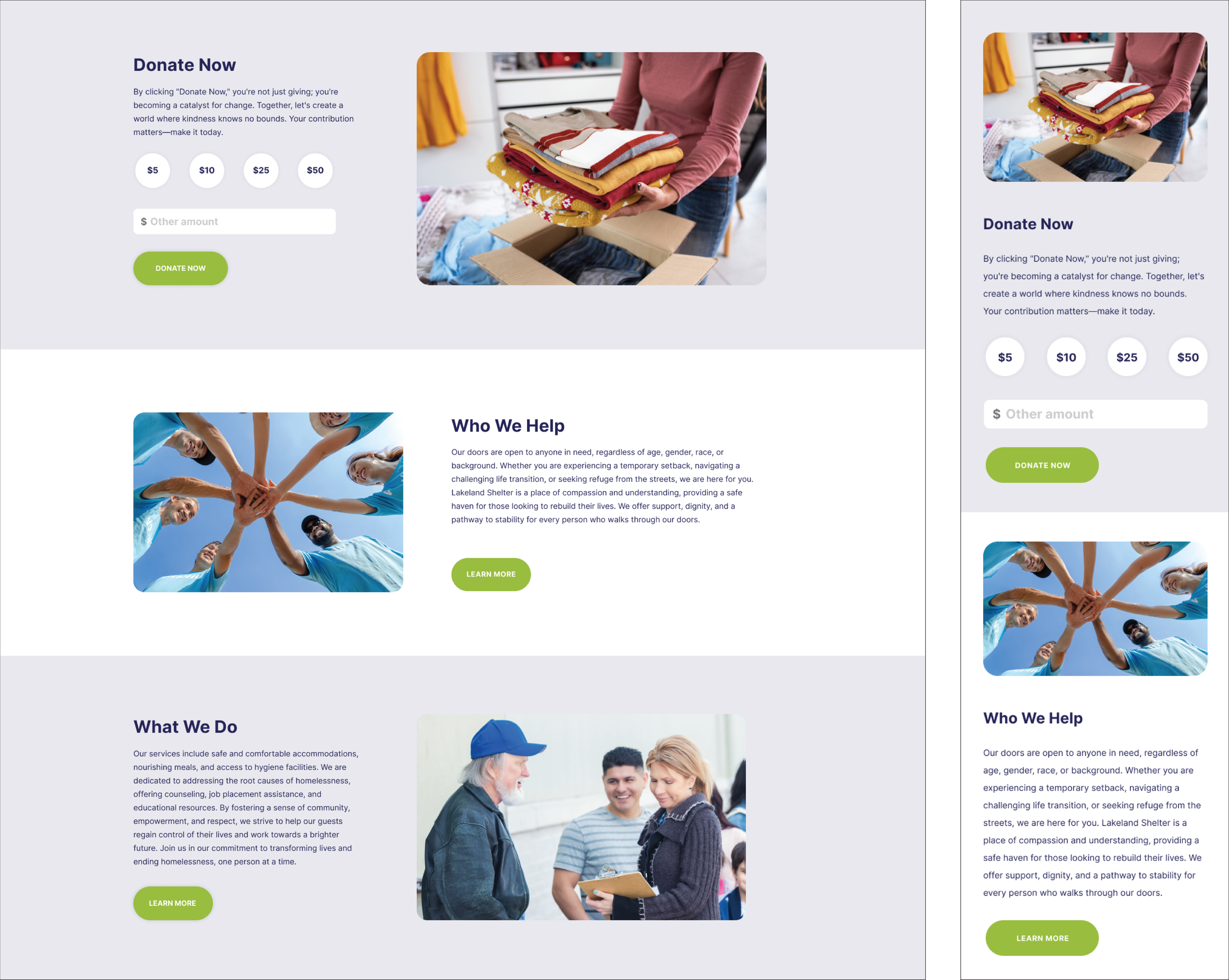
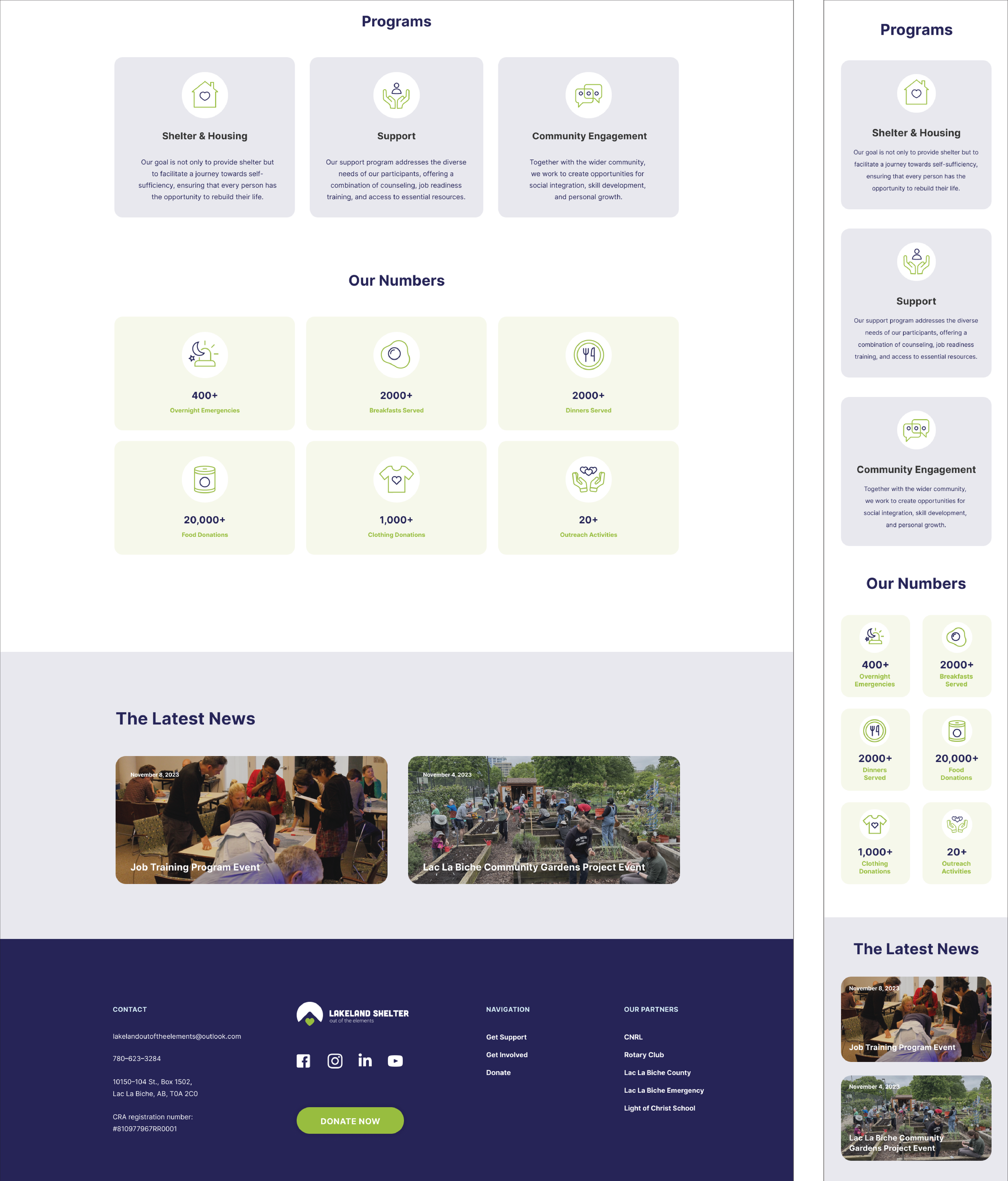
Next, I quickly conceptualized page layouts drawing inspiration from my research on personas and user flows.
The Design Development:
I made mockups to gather feedback from the client, developer, and users on the overall page layout and structure, involving the establishment of a standardized visual hierarchy. The next step involved conducting usability testing to validate the effectiveness of the designs. This included creating a scripted scenario where users were prompted to seek information on programs and services, as well as initiate donations to the organization.
In collaboration with the developer, we identified and documented any supplementary interactions that were not covered in the high-fidelity mockups. Next, I conducted a comprehensive review of all pages to guarantee their alignment with the specified designs before the website's launch.


Conclusion:
Following the launch of the new website, there has been a noticeable increase in user donations to the organization. Additionally, the client expressed positive feedback, acknowledging the website's polished and professional appearance. Users have also highlighted that the website has improved their understanding of the organization's mission and activities.
Key Takeaways gained from this project include:
The significance of focusing on the core problem. It's easy to lose sight of the end goal – addressing the users' challenges. Maintaining a user-centric perspective ensures that the solutions developed resonate with and effectively alleviate the pain points of the target audience.